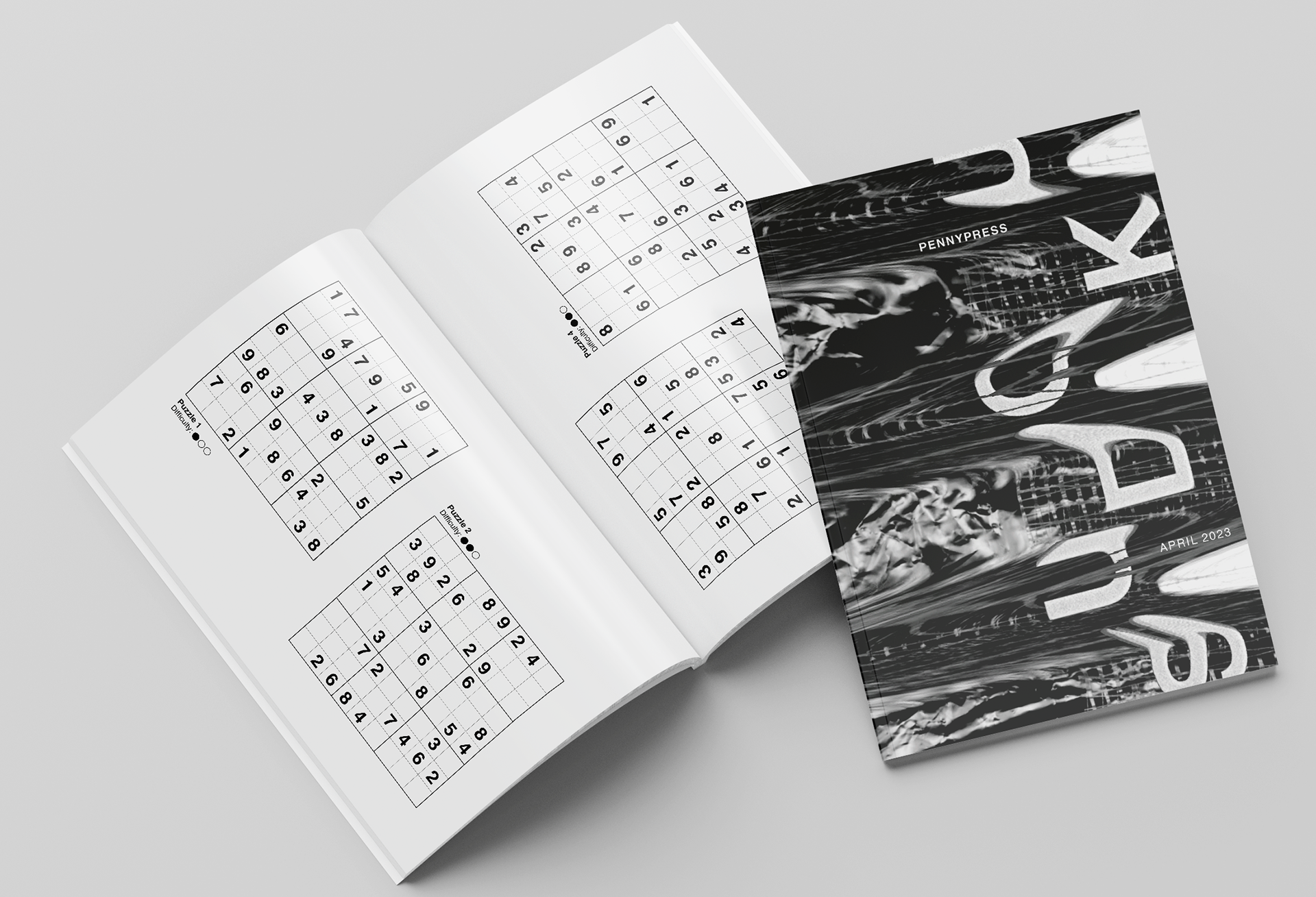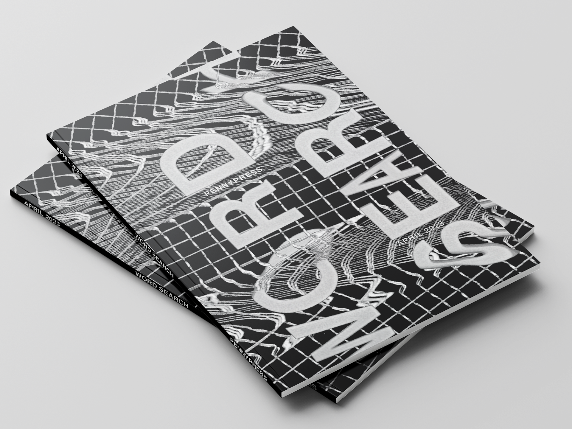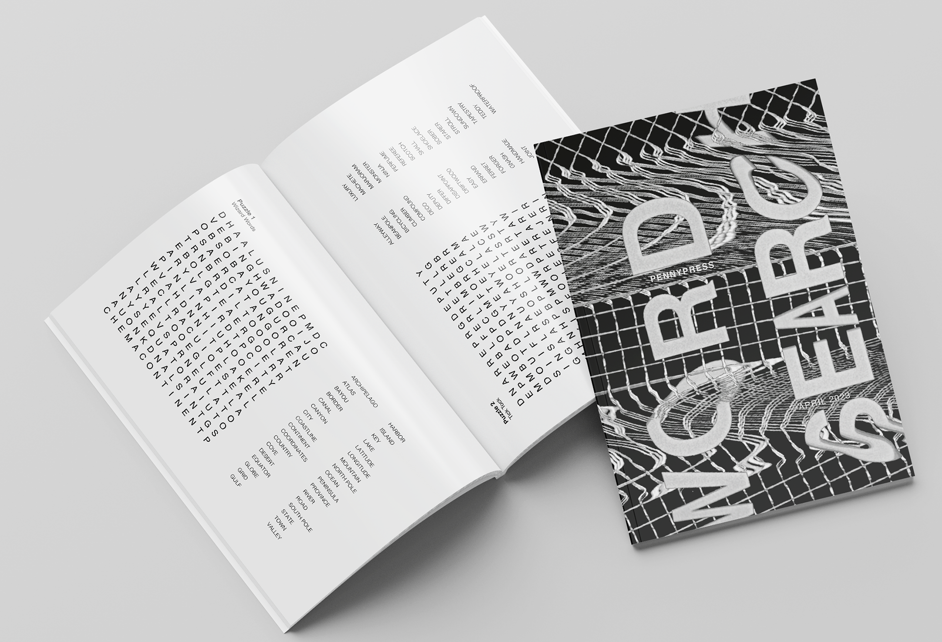



Existing System
Problem
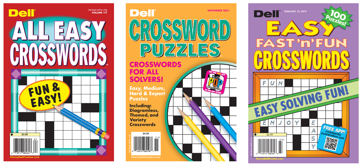
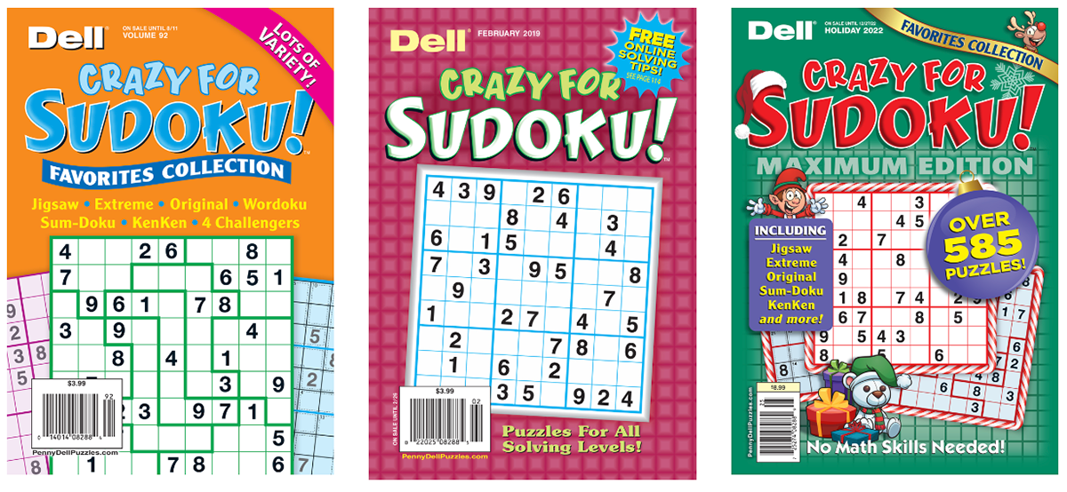
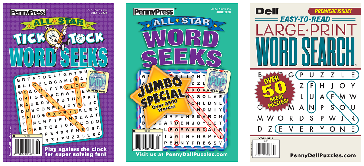
Very loud covers.
Books seem childish.
Confusing what the difference is between each book.
The books are competing with each other even though they are from the same company.
There is no apparent system of how each book is different.
Binding is a bother for left-handed people.
Books seem childish.
Confusing what the difference is between each book.
The books are competing with each other even though they are from the same company.
There is no apparent system of how each book is different.
Binding is a bother for left-handed people.
Solution
Create more sophisticated covers to cater to a broader audience.
Create a cohesive system to communicate how each book is unique, helping customers easily find what they want.
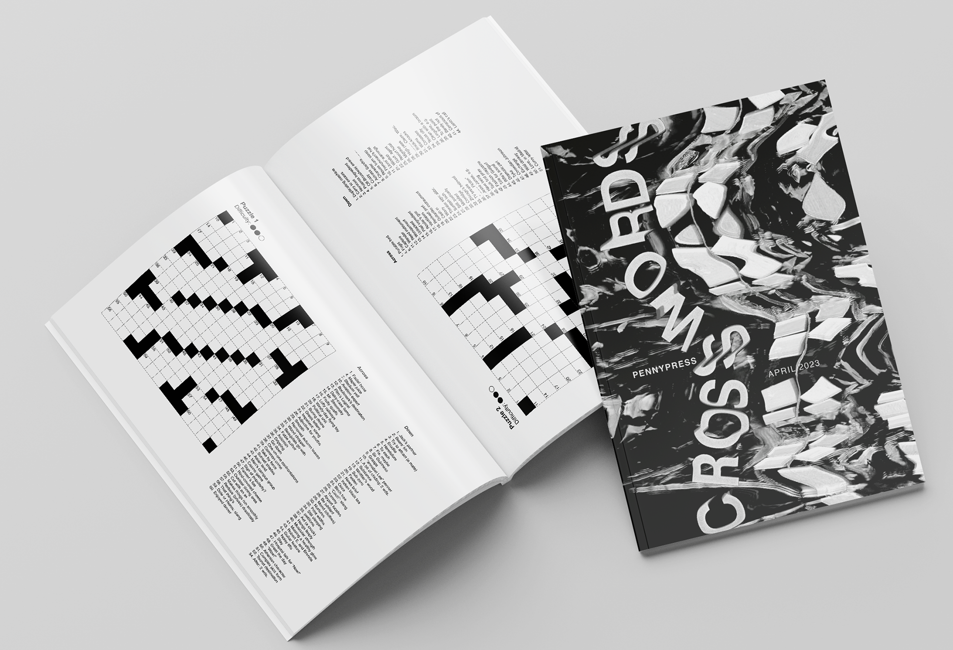
Orient puzzles on the page so they are comfortable for all handedness.
PROCESS WORK
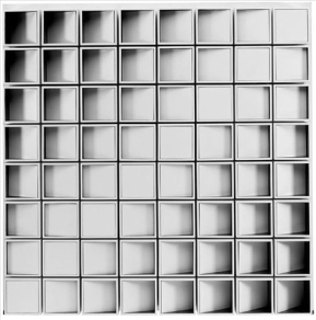
Black and white, shadows, geometric
Pencil puzzles are black and white by nature and encourage a doodle-like playfulness.
Design covers using greyscale to match the practice of doing a pencil puzzle. Incorporate the puzzles' inherent geometric structure in the design. Play with the use of shadow.
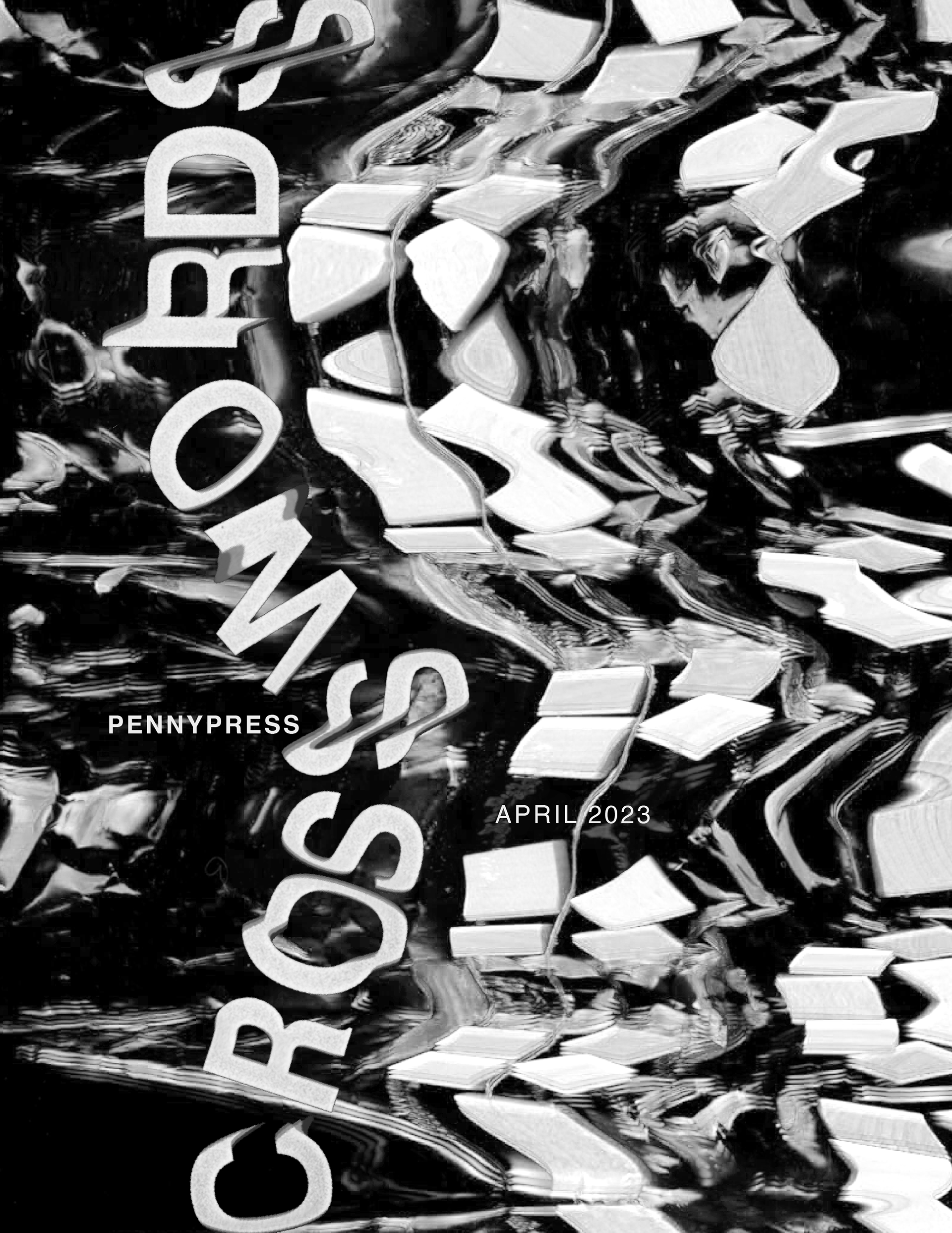
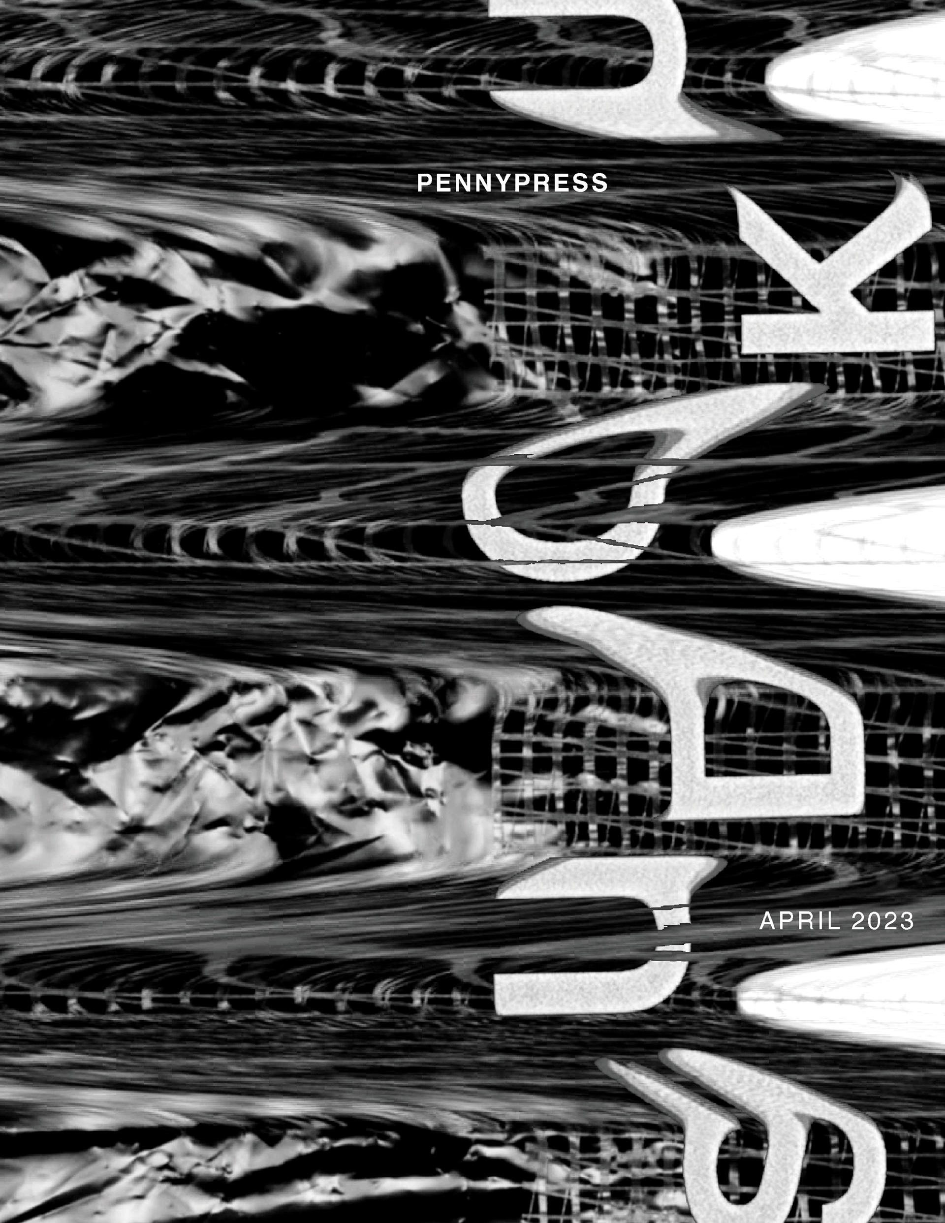
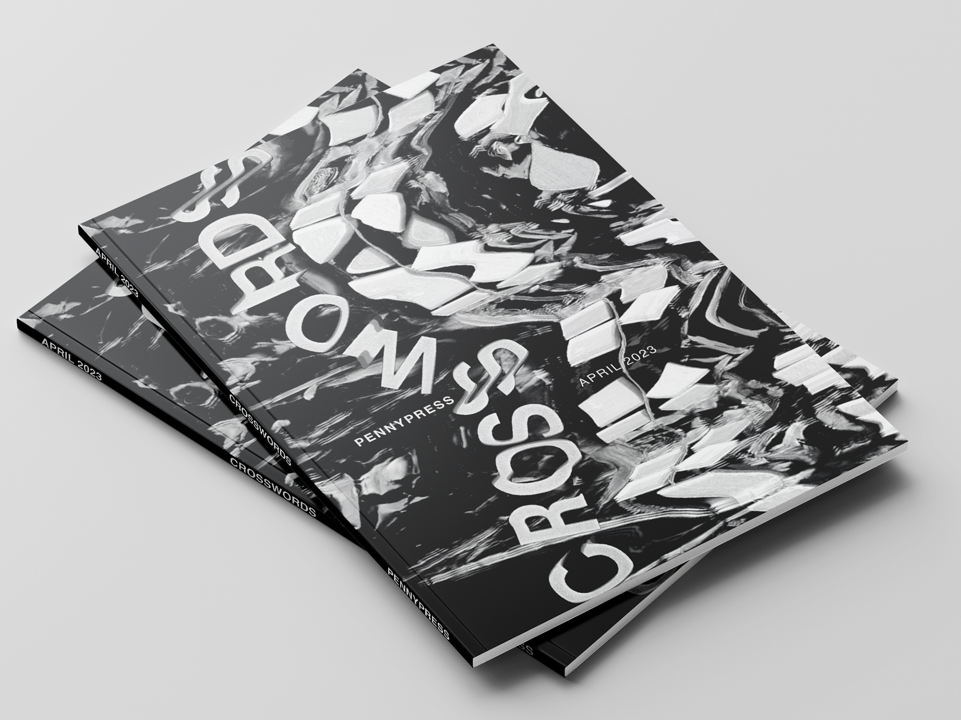
Greyscale and geometric/dynamic shapes create a sophisticated look, while a more playful typeface makes the book feel inviting.
This style is sophisticated, can cater to the broadest audience, and is gender-neutral. The style also lends itself to
a conceptual depiction of the puzzle.

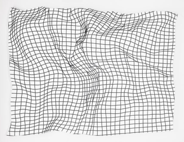
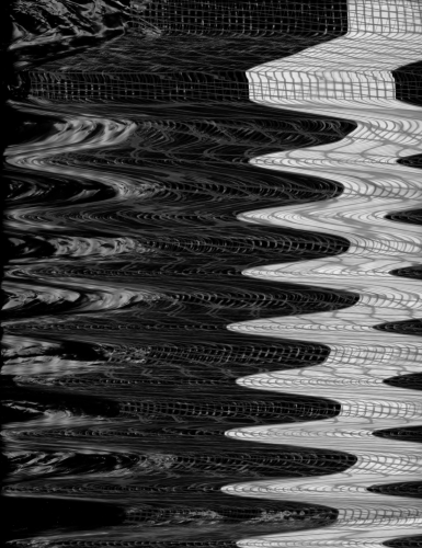
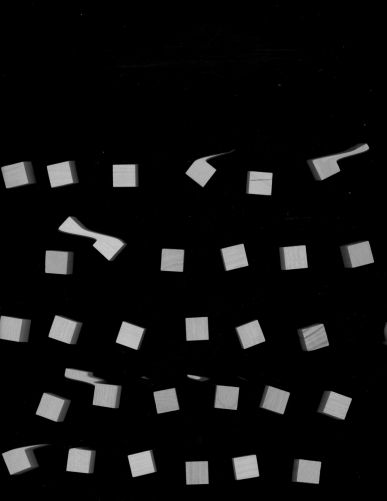
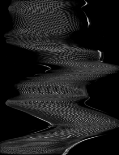
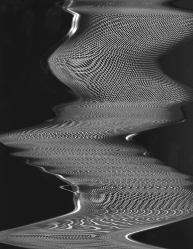
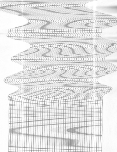
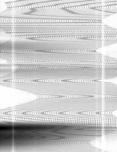
Scan Exploration
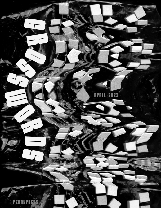
The imagery for this design was created using analog methods: physical objects on a scanner. This matches the tactile experience of doing
a pencil puzzle.
I manipulated these objects to create motion during the scan, emulating the movement of your eyes while solving the puzzles.
I chose to edit these images to black and white, keeping the original intent of matching pencil and paper.
I chose to edit these images to black and white, keeping the original intent of matching pencil and paper.
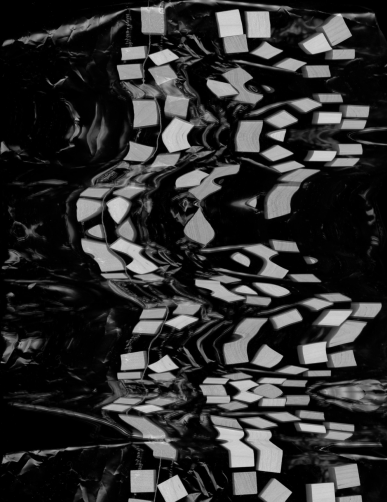
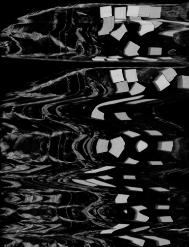




Type Exploration
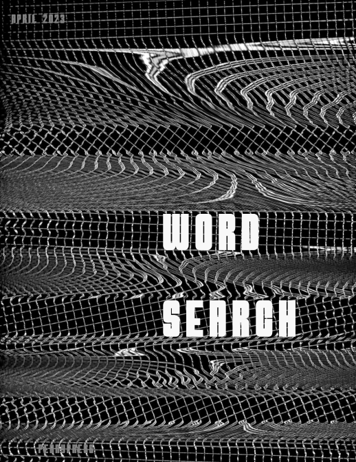
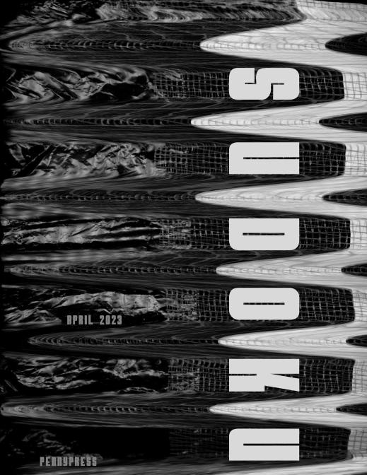
In my first iteration of this design, I used the typeface Atomic Bomb. This display-style typeface was bold, and I felt it was competing with
the cover imagery rather than complimenting it. However, I liked how the title interacted with the image on the Crosswords cover, so I tried to implement more of this in the next iteration.
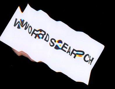
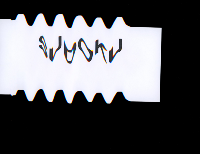
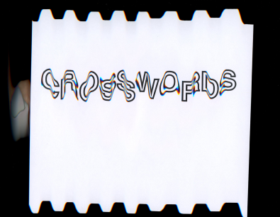
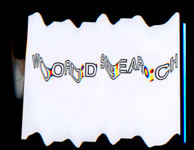
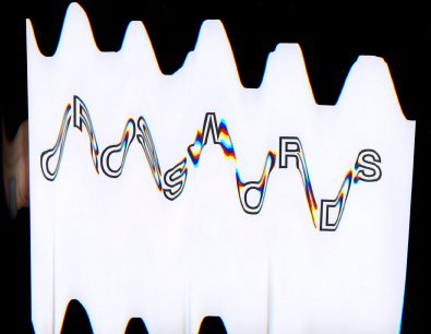
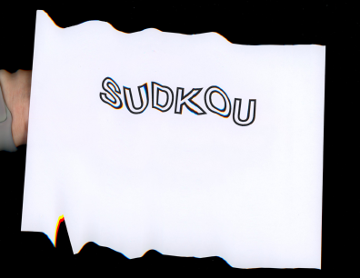
Title Scans
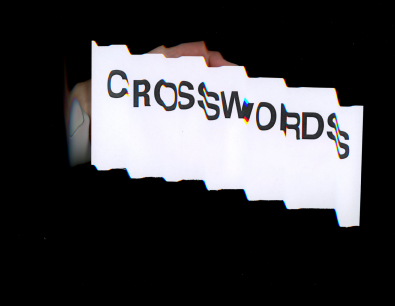
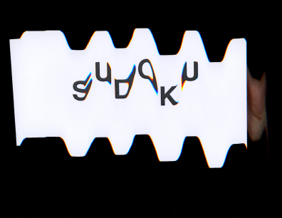
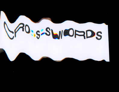
To make a more cohesive design, I put the titles through the same manipulation I did to create the covers. This yielded some exciting results! I used Helvetia Bold for this endeavor; I wanted a more straightforward style that lent itself to be manipulated while maintaining legibility. I experimented with outlined and solid types and decided that
the filled type was easier to read; I wanted it clear which book held
each puzzle type.



Integrating Type and Image
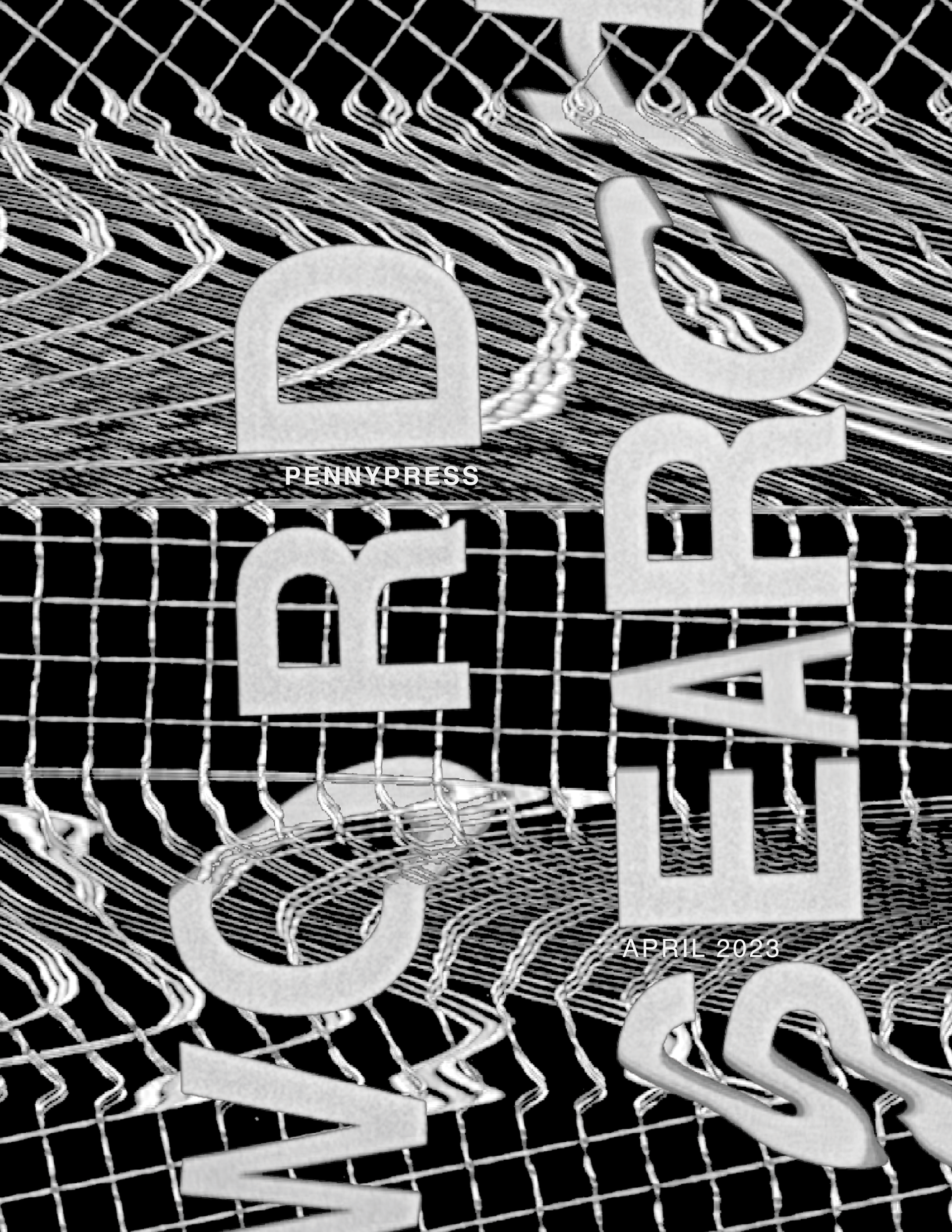
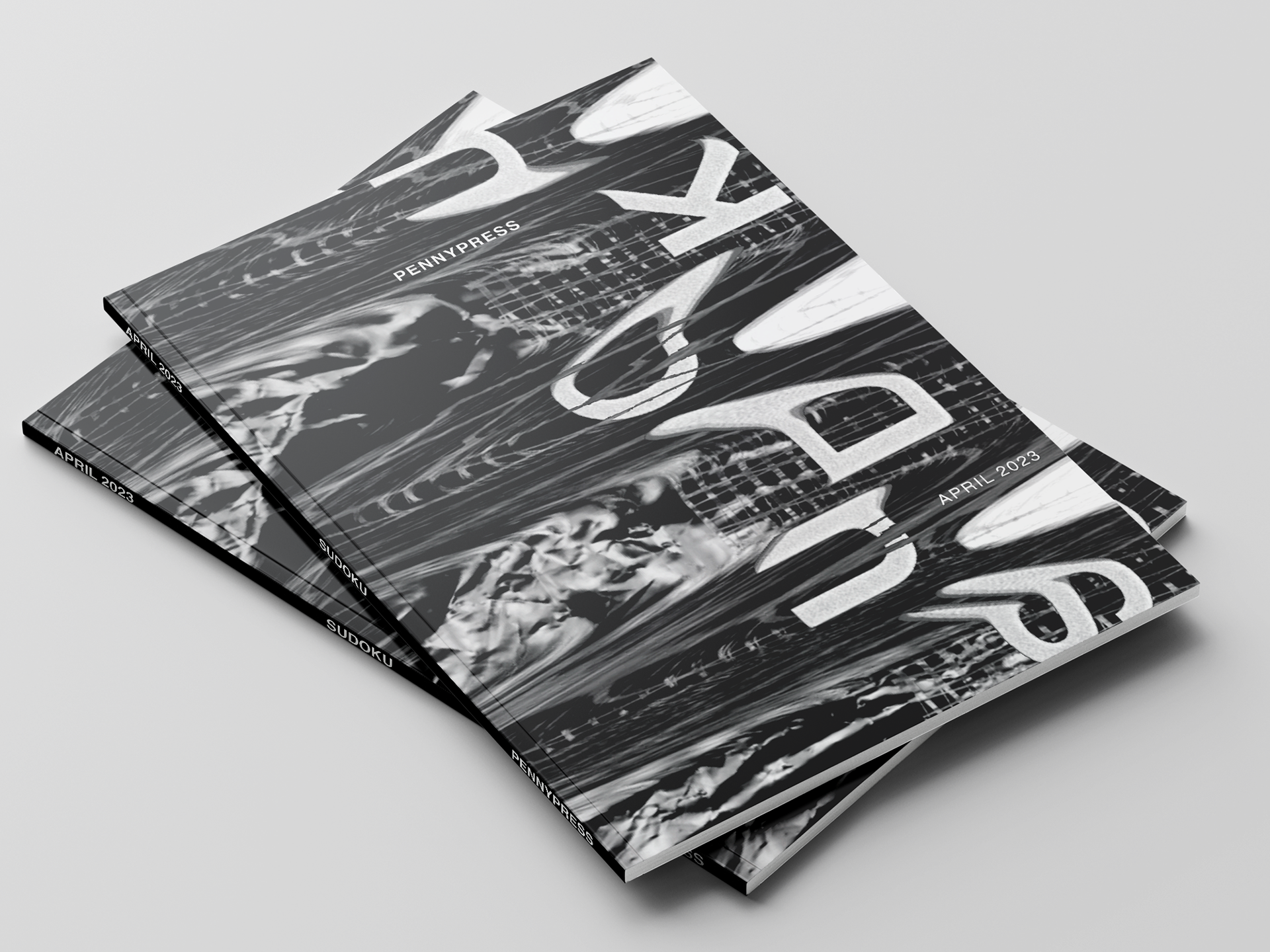
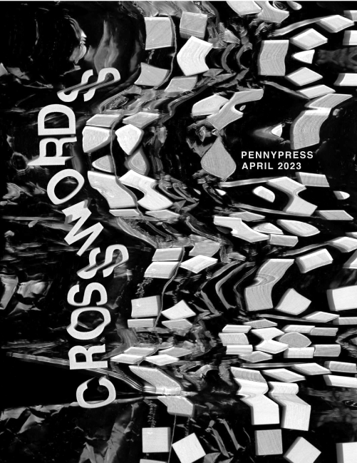
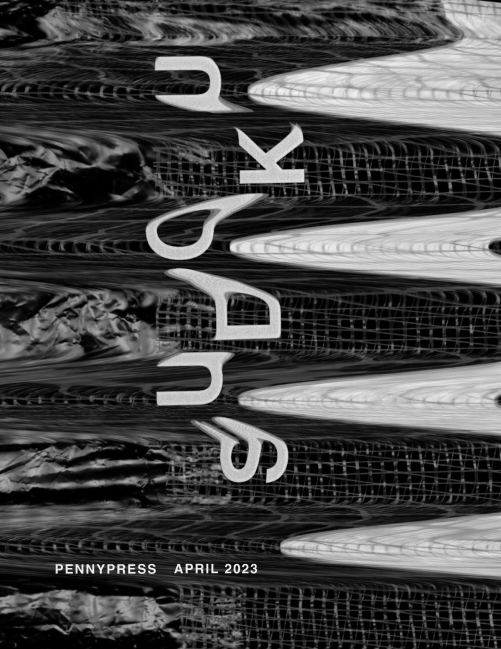
I then combined the scanned images and titles and liked how they sat together on the page. This was a much more fluid integration of earlier iterations.

Final Touches
I made the titles larger and cropped off the page to create a more dynamic composition. I also decided to weave the image and type together. Finally, I leveled out the secondary type to ground everything
and counter the title type.
