Awarded Silver
Graphis New Talent 2024
Graphis New Talent 2024
Mockups
Existing System
Problem
How might I create a cohesive brand identity for Little Free Library that encapsulates the power and impact of generosity and stewardship in a community using a comprehensive visual system the captures the the idea of “planting books in your community”.
Solution
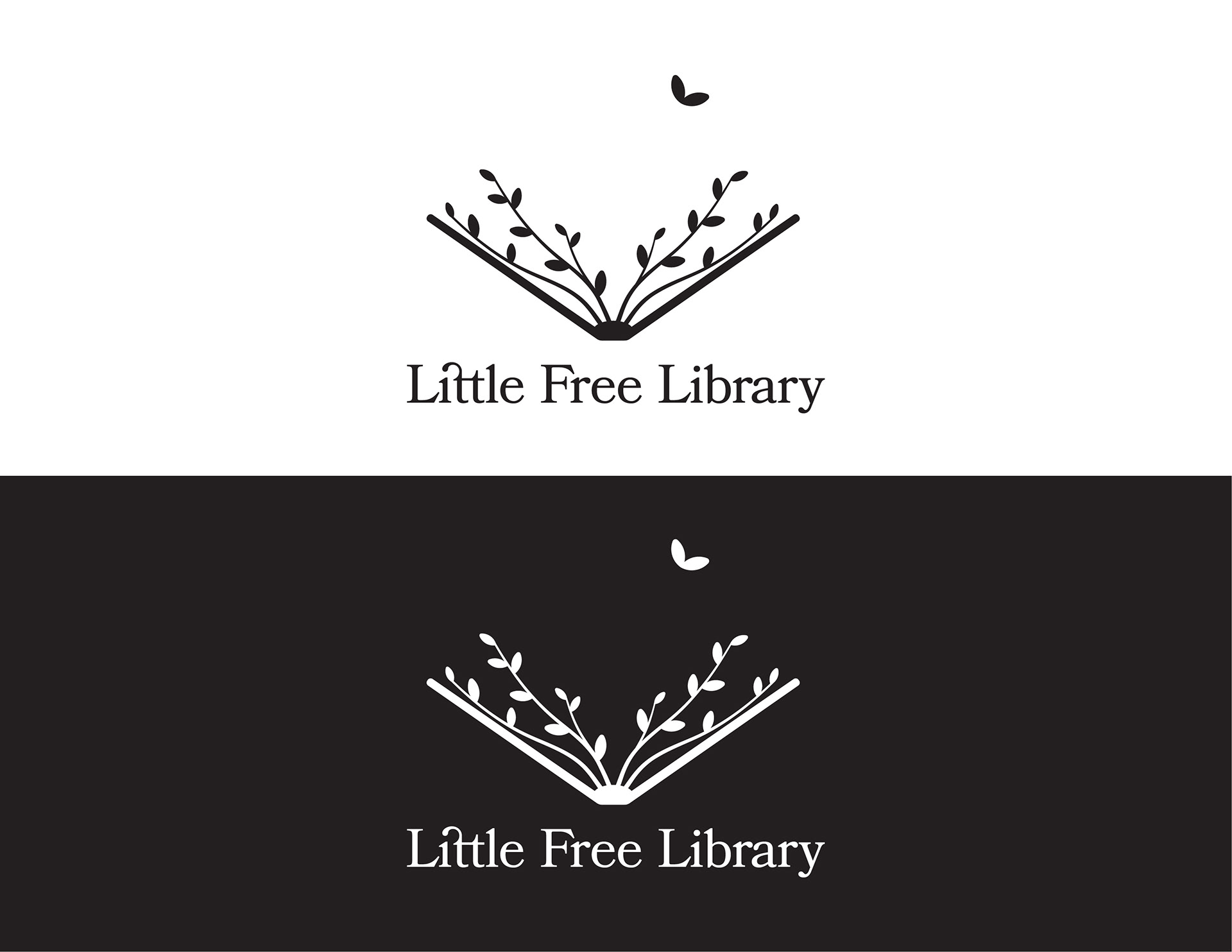
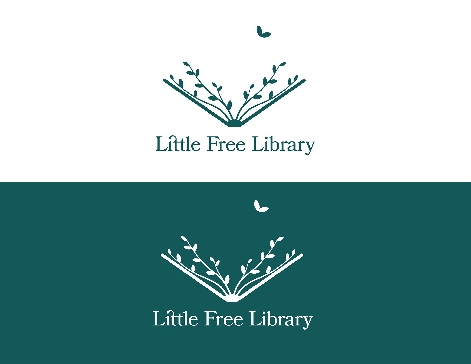
Create a light weight and open logo to represent the personality
of this organization including a metaphor that equates sharing books with planting seeds and growth.
Add flair through the use of typefaces that match the feel
of this nonprofit.
Create a color palette that calls to the feeling of nature
and the access provided through Little Free Libraries,
night and day.
Use visual elements to capture the uniqueness of Little Free Libraries across the world.
Show the journey a book can take through a Little Free Library
using a playful visual narrative.
Logo
An iconic representation of the Little Free Library structure.
Feels heavy.
Book facing down feels closed off.
Typeface is standard and lacks personality.
Feels heavy.
Book facing down feels closed off.
Typeface is standard and lacks personality.
Website
Emphasis on numbers, not people or personality.
Heavy color blocking.
Strong statistics but lacks visual interest.
Heavy color blocking.
Strong statistics but lacks visual interest.
Process Work
Logo Development
Brainstorming via icon, index, and symbol framework.
Selected ideas circled in blue to move on to vector exploration.
Selected ideas circled in blue to move on to vector exploration.
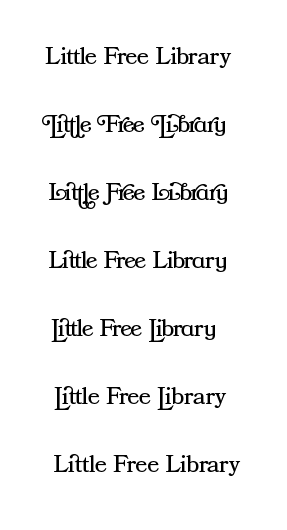
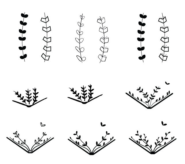
Type and Vector Exploration

Color
Primary Blue
# 125959
Symbolic of the sky at night.
Little Free Libraries are accessible to everyone, always.
# 125959
Symbolic of the sky at night.
Little Free Libraries are accessible to everyone, always.
Secondary Blue
#B8D9D5
Symbolic of the sky during the day.
Represents calm, friendly, and openness.
#B8D9D5
Symbolic of the sky during the day.
Represents calm, friendly, and openness.
Tertiary Green
#BFD65D
Represent growth, giving, and a light spirit.
#BFD65D
Represent growth, giving, and a light spirit.
Final Logo Lockup
